How to Dynamically Populate an Alert Bar from the Webflow CMS
This high-level example shows how to create a responsive notification banner that utilizes data from a Webflow CMS Collection called "Announcement Bars." For additional help, pixelgeek shows how to create a CMS driven notification bar along with a custom modal.
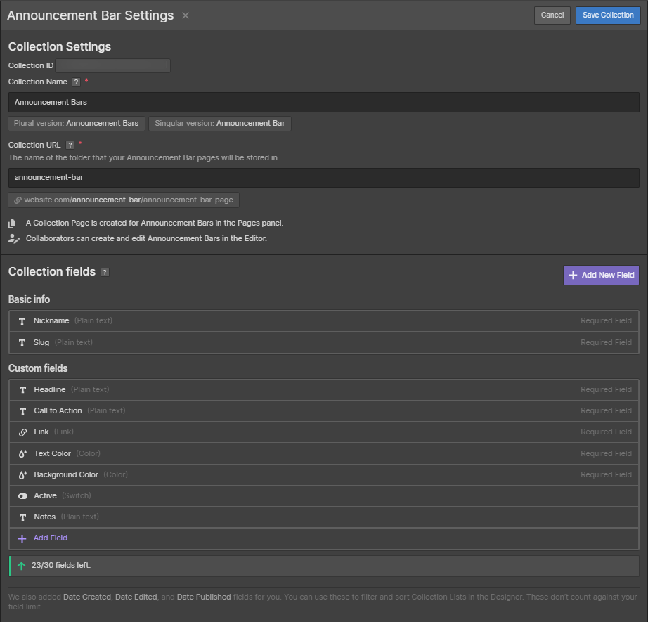
Announcement Bar Settings: Fields include "Headline," "Call to Action," "Link," and colors
Step 1: Start by creating a collection, like "Announcement Bar." If you don't like that name, you could use "Hello Bar," "Notification Bar," or "Alert Banner."
In the collection, create these custom fields and any others that make sense for your use case:
- Nickname: The default "Title" was renamed to "Nickname." You could leave the default and then use title in the banner. However, since promotions often have nicknames or are tied to campaigns, nickname was used instead.
- Headline: This will be the actual message.
- Call to Action: The text prompting site visitors to take action. Typically this will involve an action verb or a value related phrase.
- Link: Where should the user be taken when the banner is clicked.
- Text Color: What color should the text be? Pick a color with appropriate contrast against the background.
- Background Color: What color should the banner be? If the same color is always used, repeat visitors may not pay attention to the banner on subsequent visits.
- Active: This will be used to turn banners on and off. A hack would be to unpublish the item from the Collection. Doing so could result in sloppy code and potential page rendering issues.
- Notes: Not meant for extensive documentation, the notes field could capture info on associated A/B tests, dates the banner is to be active, a link to external documentation, etc.
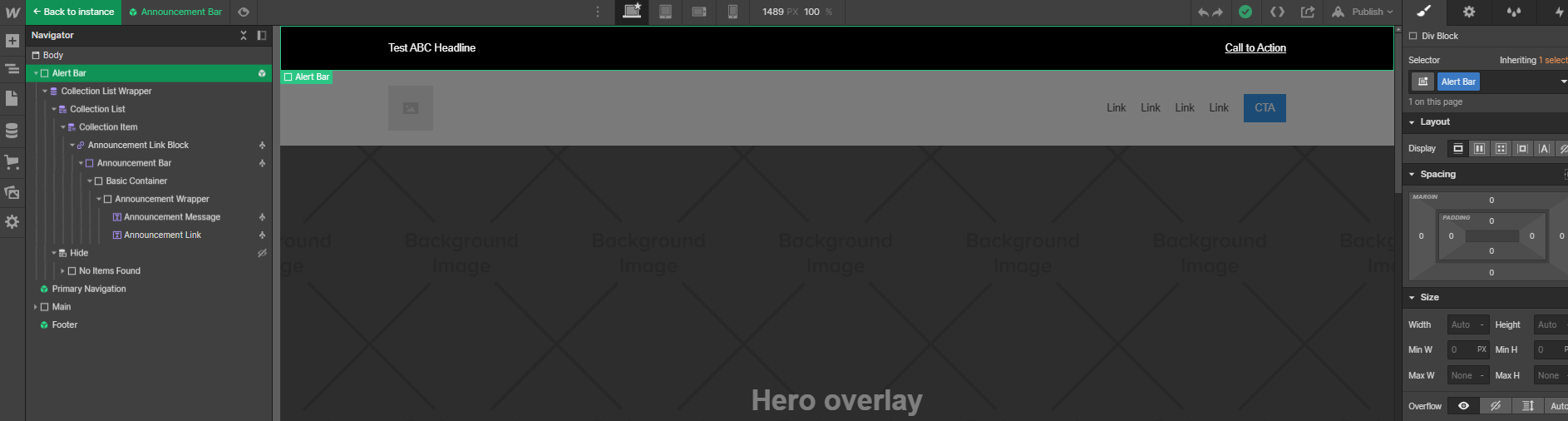
Overview of an Alert Bar in the Webflow Designer after being built from scratch
Step 2: Create a div and assign it a class. In this example, the top most div is named "Alert Bar." It is set to display block and position sticky with a z-index of 1. If you don't want the notification bar to be visible as a site visitor scrolls down the page, leave the position static.
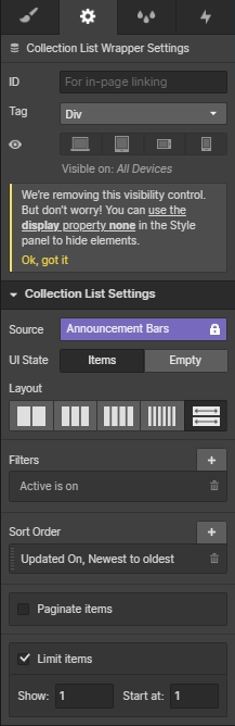
Configuring the Alert Bar Collection
Step 3: Add a Collection to the page. Set the values for your needs. In this instance, we're looking to see if there are any alert notifications set to active or not. Then, limiting to only display the most recent item. Adjust for your needs.
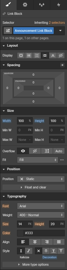
Link Block Settings: Part 1
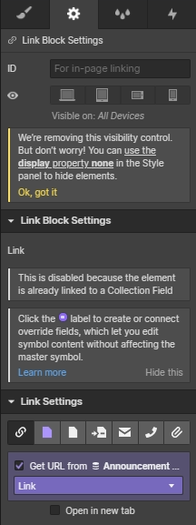
Link Block Settings: Part 2
Step 4: Add a link block to the page and assign it a class name. "Announcement Link Block" is used in this instance. Width and height are both set to 100% and underlining is turned off. The link that a site visitor goes to is also configured at this stage and is obtained from the Announcement Bar Collection.
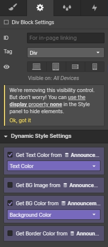
Configuring the "Announcement Bar" div to obtain colors from the Webflow CMS
Step 5: Add another div and assign it a class name of "Announcement Bar." Assign it padding in keeping with the design. At this stage, also obtain colors from the Announcement Bar Collection.
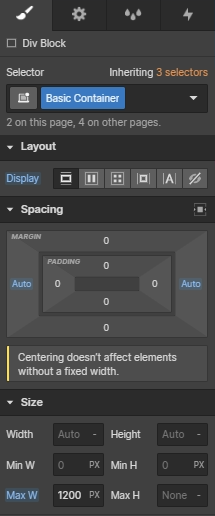
Setting a maximum width to prevent designs from becoming too spread out
Step 6: Add a div with the class name of "Basic Container." In this design, the div is used to constrain a section's max width to 1200 px.
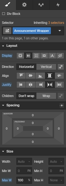
Setting the Announcement Wrapper to flex
Step 7: Add a div with the class name "Announcement Wrapper" set to flex. The layout can be changed easily from horizontal to vertical given this structure.
Step 8: Add in two text fields -- one for the alert text and one for the call to action. Give each a class name. This example uses "Announcement Link" for the call to action, which may be misleading to some. As part of it's styling, it's given an underline to reinforce action for the site visitor.
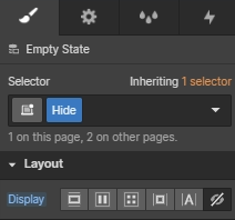
Step 9: Add a class of "Hide" to prevent a "No Items Found" message from appearing when there are no active alert notifications.
Finishing Touches:
- If the Alert Bar is to be used on multiple pages, turn it into a Symbol for easy re-use.